2024
Jazz Festival Poster & Flyer

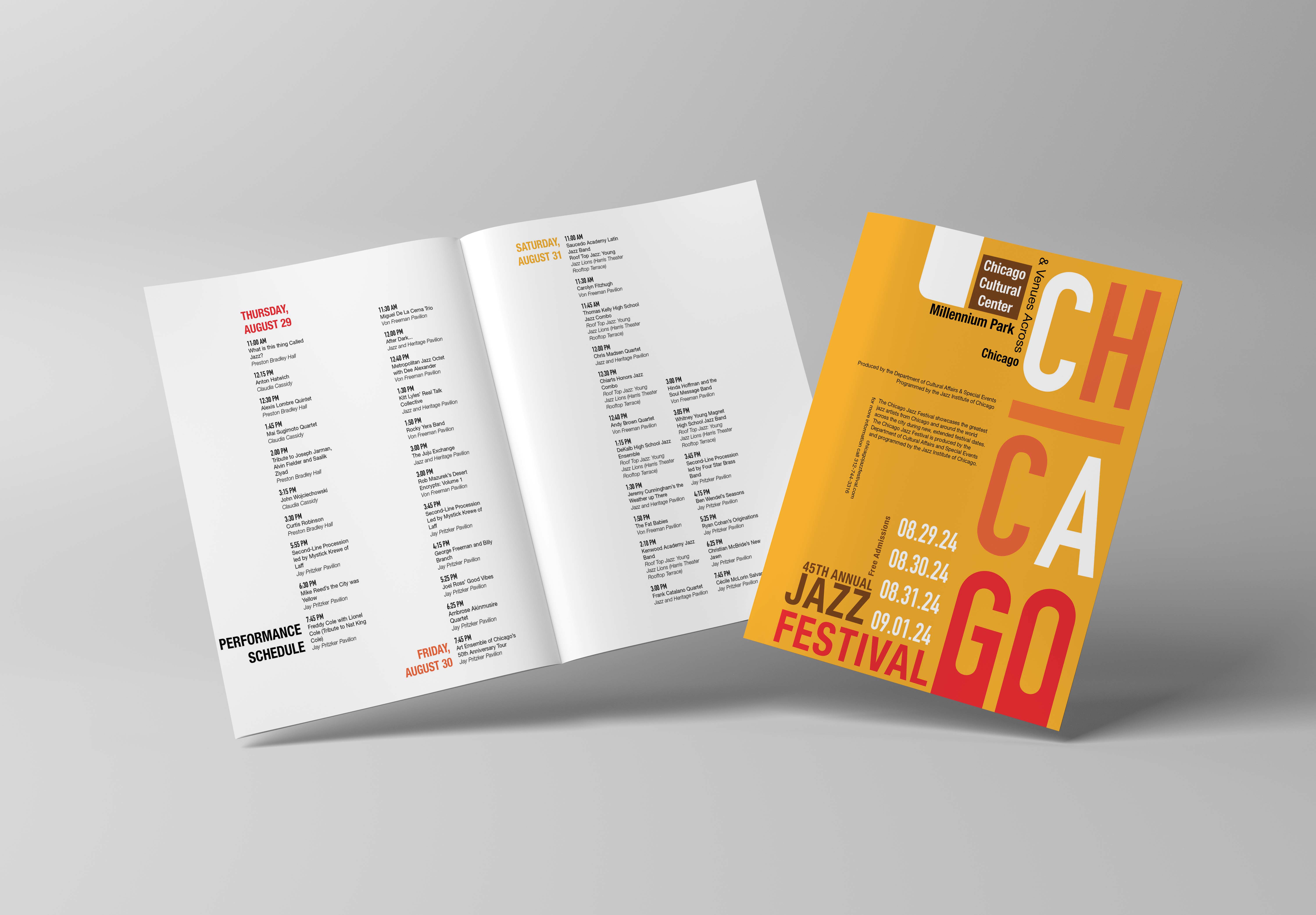
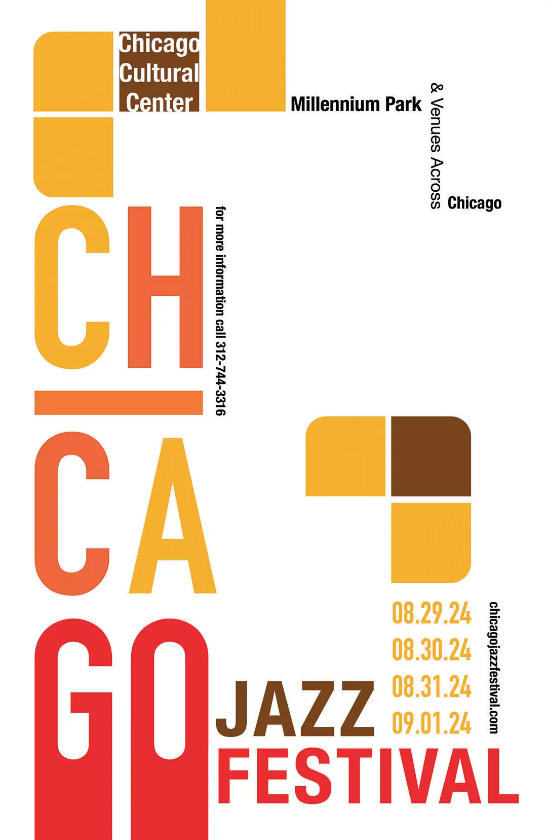
This was a two part project where we first created a poster for a jazz festival in Chicago, and then we had to create a program guide in a similar style to the poster. After a history lesson of the different eras of jazz, I decided I really liked a lot of the fusion jazz specifically, and based the festival poster around that.
The poster uses brighter colors to bring the fun that fusion jazz does, and retains a modular shape seen during that era of design to represent the fusion aspect of it. The modular shape of the letters and the squares form the shape of the letter G–telling you to GO to the Jazz Festival in Chicago. The main poster remains open and airy where simplicity remains the key.
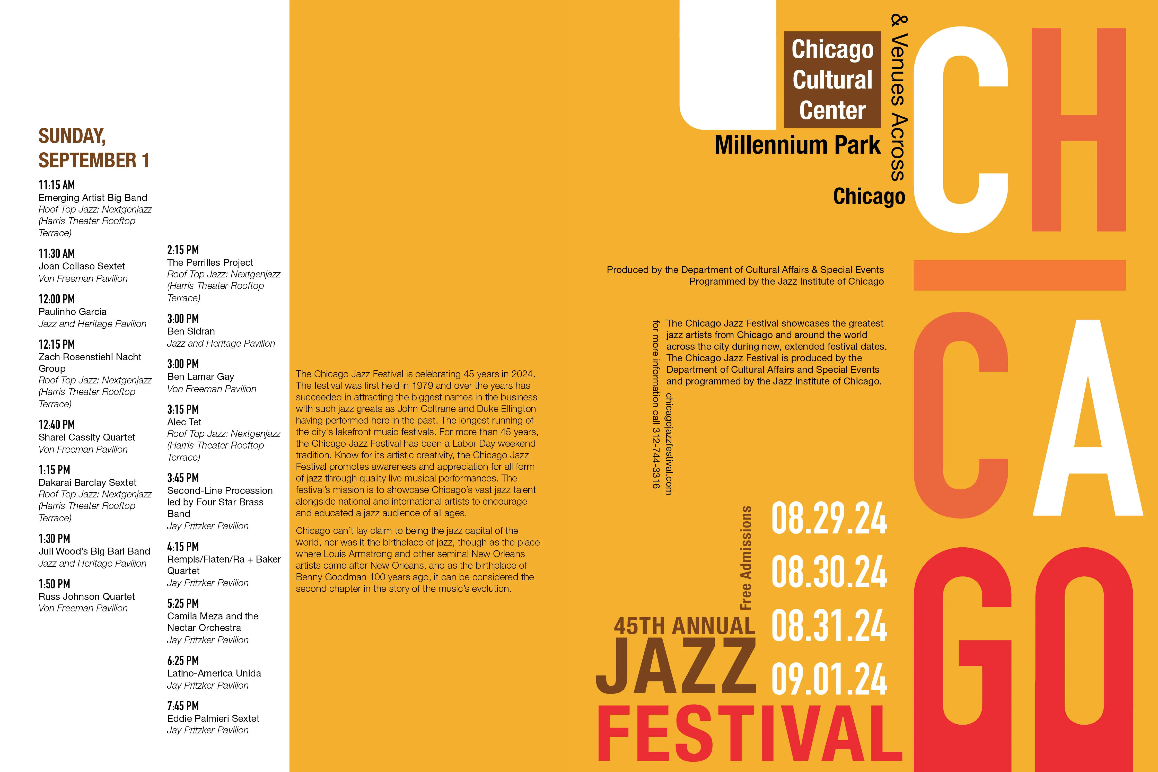
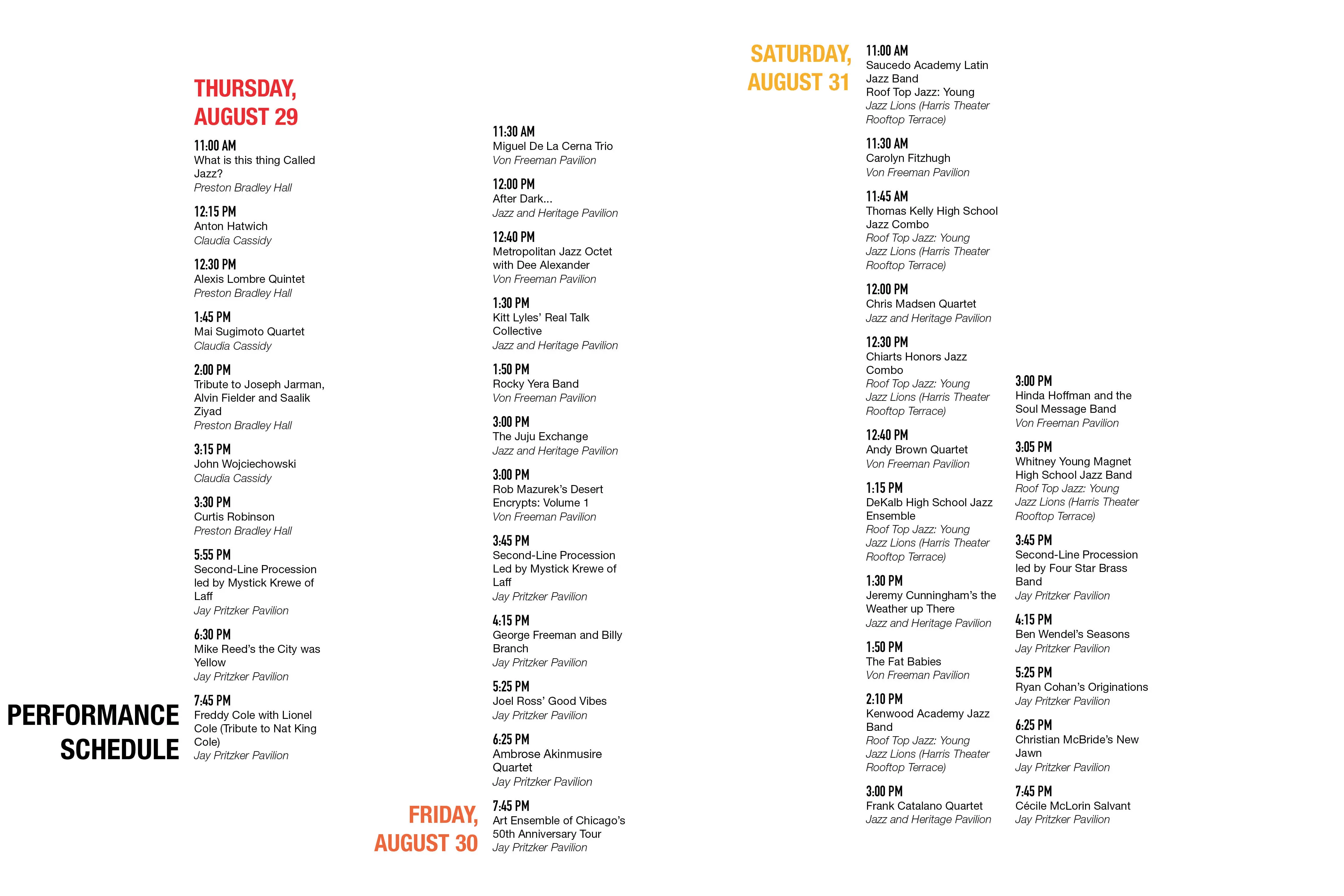
Following that simplicity, the inside of the program guide retains the white open spacing while the cover morphs into a solid yellow block with more information on it. The shape of the G is broken, but shape of the information paragraphs spread out from the horizontal I in Chicago in a repeated pattern to the information at the bottom of the cover.
Overview


Guide
Kelsie Lopriore
Graphic Designer
©2026 BY KELSIE LOPRIORE